

With the S&P 500 hitting new all-time highs on a consistent basis, many people are wondering when this rally will end. Rather than focus on what could go wrong, I like to focus on the opportunities in front of me and manage risk in each trade on its own merits.
I am a swing trader and I look at thousands of charts each week. I seek out what appear to be low risk/ high probability trades to hold for up to a couple of weeks. During this process, I often observe charts of stocks which appear to have great longer-term potential. One such stock is Potash Saskatchewan (POT). Below is a multi-timeframe analysis which outlines how a longer-term trader might approach an investment in POT.
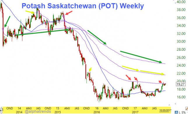
The chart above is constructed with weekly data, it shows the trading from mid-2013 through 10/20/17. The blue moving average is the 40 week (approximately 200 days.) It is generally considered longer term bullish when a stock is above a rising 200 day moving average as it is in POT.
Also on the chart are three Anchored Volume Weighted Average Price (VWAP) levels. The first is noted by the red arrows, it begins at the 2015 high in the stock near 38.00. Notice how this VWAP acted as resistance in late 2016 and early 2017. Both of those tests of the VWAP quickly found sellers who regained control of the stock and quashed the rally attempt. Now in the last month, this VWAP has been tested repeatedly and the buyers seem more persistent.
The yellow arrows show the VWAP from the peak in 2014, its current value is 21.60. This is the first potential upside target for the stock if it confirms strength as outlined on the shorter term charts below. Notice how that VWAP is also located near the highs of the fourth quarter of 2015.
The green arrows show the VWAP from the severe breakdown in the third quarter of 2013, it is located at 24.45. If the stock can continue to rally over the next few months, this would be the second longer term upside potential level.
The chart below is the daily timeframe for POT, it covers a little more than a year of trading. The green moving average is the 50 day, notice the upward slope which indicates buyers are in control of the intermediate term trend. The blue moving average is the 200 day moving average, it is also rising, this confirms the longer term trend is also higher.
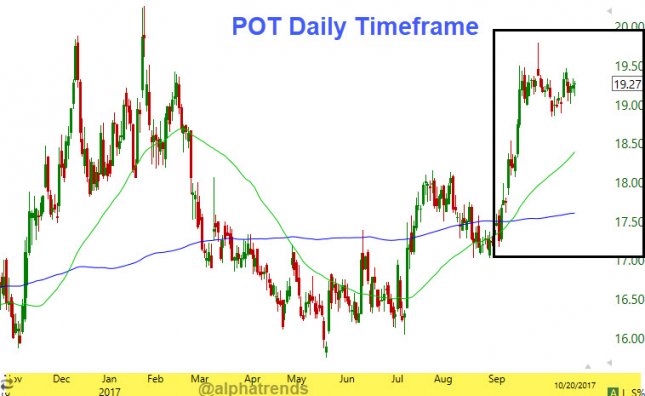
The boxed in area of the daily chart above is magnified for a closer look using the 65-minute timeframe in the chart below.
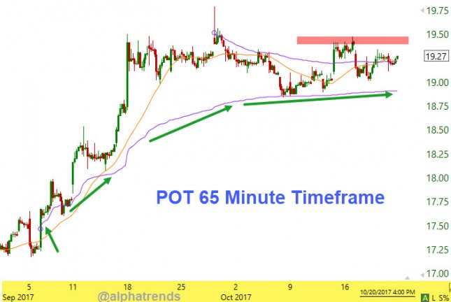
On the chart above, the green arrows indicate the VWAP from the beginning of the momentum campaign in September, notice how buyers defended that level in early October. This 65-minute timeframe chart allows us to identify where the buyers will regain control of the shorter term timeframe for investment purposes. We want to buy the stock as it takes out the October 16 high of 19.47, this would indicate a higher high above the flat/ rising 5 day moving average (orange.)
Before any stock trade is entered, there must be a backup plan in case the market does not agree with our analysis. A backup plan is our stop loss, which minimizes any loss we take if the rally attempt fails. For POT, a stop below the October low of 18.84, this represents just $0.63 or 3.3%. This level makes sense because it is also below the VWAP from the September rally and a failure of that level would indicate the buyers have lost control of the emerging trend.
If upside objective number one of 21.60 is hit, it would represent a profit of $2.12 or 10.8%, this would be a risk/ reward ratio of greater than 1:3. If the stock continued up towards the second objective of 24.45, a profit of $4.97 or 25.5% would be achieved, in this case, it would represent a risk reward ratio of close to 1:8! As always, make the trade your own based on your timeframe and be sure to raise stops under higher lows if the trade works.