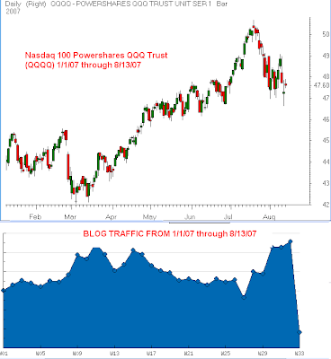
I was looking at my year to date blog traffic report and I noticed that it is almost the exact inverse of the chart of the QQQQ. A simple explaination is that when times are good market participants are complacent and that when the markets show downside, traders and investors are looking for reasons. I don’t think this chart shows anything new and I don’t it will help us make money but I know a lot of you are chart geeks like me and think it’s interesting. I think I was on vacation on week 27 which is why readership diverged so strongly, this also happened in March.

this is an actual blog traffic report from January 1 through today.


